Categories
Author: AdminAngel
Categories
Jetpack Repeat Visitors
Thanks for coming to my site!!
Categories
jetpack form
Categories
jetpack gif
Categories
jetpack gallery


There’s definitely a lot more than the companies that were mentioned in previous posts. However, I can list and describe the changes made below![]() . Fanta has the same logo as before just without the orange peeking from behind the letters. Buick changed from the 3 cascading shields to just 3 shields side by side. Mastercard dropped the company name in front of the circles, now there’s just the red and yellow circle inside of each other.
. Fanta has the same logo as before just without the orange peeking from behind the letters. Buick changed from the 3 cascading shields to just 3 shields side by side. Mastercard dropped the company name in front of the circles, now there’s just the red and yellow circle inside of each other.
Categories
Company rebranding
The goal for a company’s logo is to gain a social identity and make an impact. There is many of reasons why a company would spend millions to showcase their brand with a new logo or even change their name up a little. The most obvious reasons would be to stay relevant in the constant changing market, the company being under new control, or simply just because. However some businesses change logos to detach themselves from a negative past, or to attract a different market. For example Dunkin’ Donuts changed their name to “Dunkin'” in order to appeal to more people than just the ones that want donuts. They don’t want to specialize in the donut part, more so the coffees and drinks that they offer while still keeping the original “Dunkin Donuts” vibe.
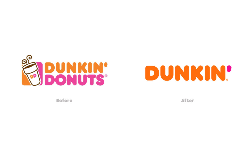
Dunkin’ Donuts before and after
Categories
Companies Debranding
Recently companies have been dropping the detail of their logos. Foe example, the Firefox logo used to be a bright orange fox that was wrapped around the Earth. Now the logo is more of a 2D, low poly image of a fox with a blue ball in the middle. Before this everyone wanted bigger logos that could be blown up and placed anywhere, which makes room for more details. As we are currently living in a mobile world, companies need to drop the details so their logos are more recognizable on smaller screen.

Categories
Why Companies Simplify Their Logos
Despite the internet in unity about the small changes being made to their favorite apps and brands, the designers for these companies have a real reason for changing a brands identity. Each logo has its own detailed document on why the designer has chosen this image. From a designers standpoint the new logos would make sense, as far as them being more symmetrical or easier for visually impaired users to recognize. However, people react negatively to change all the time, even if the reaction is justifiable.
Categories
I Wanna Go Homeeee
Where
There’s this place on Earth, I think its pretty cool. We zoom into the earth its in North America. As we soon some more we go to the east coast of United states. A small town in North Carolina, Rockingham. Sits a wooden square i call HOME